Page 1 of 1
Steel guitar graphic anywhere?
Posted: 3 Mar 2003 6:00 pm
by Michael Marchelya
Anyone know where I can find a graphic of a steel guitar that I can use in a WORD doc? I'm trying to make an "ad" I can hang up at music stores, etc. to try and find musicians to jam with. I'm hoping to incorporate the graphic to help get attention (or serve as a warning sticker, depending)

Thank you,
Mike
Posted: 4 Mar 2003 10:24 am
by Joerg Hennig
About three years ago, I drew one myself with "Paintbrush". Resembles an SD-10. Don´t know if it will work for your purpose, but if you like, I´ll be glad to e-mail it to you.
Regards, Joe H.
Posted: 4 Mar 2003 11:08 am
by Michael Marchelya
Joe, please do send it along. Thank yo very much. Mike
Posted: 4 Mar 2003 1:59 pm
by Bill Ferguson
Micheal, I have a great "Word" steel guitar that I use on my business cards.
Will be happy to send if you would like.
Drop me an email and let me know as I don't get to check the forum everyday.
Bill
Posted: 4 Mar 2003 2:12 pm
by Richard Sinkler
Bill, could you email it to me also.
Thanks
------------------
Carter D10 9p/10k
Richard Sinkler
Posted: 5 Mar 2003 9:33 am
by Craig A Davidson
If it isn't too much trouble could I possibly get it too, so I might use it on our steel jam posters.
------------------
1985 Emmons push-pull, Nashville400, 65 re-issue Fender Twin, Fender Tele
Posted: 5 Mar 2003 10:19 am
by Rick Schmidt
the nicest one I've seen is more like what I'd call "computer art" (more than just a logo type of thing) done by forumite Jerry Gleason. It's beautiful! Don't know if it's ok to use it without Jerry's permission though.
Posted: 5 Mar 2003 10:50 am
by Bill Ferguson
Ok, I have been covered up with emails.
Go to this link and it should open in a Word document.
Then ungroup the picture and you can make changes to suit you.
This was originally designed by Mac Atcheson, then I modified it for my Green Emmons and again for my Black Birdseye Carter.
http://www.steelpicker.com/pictures/Word%20Steel%20Guitar.doc
Have Fun
Bill<FONT SIZE=1 COLOR="#8e236b"><p align=CENTER>[This message was edited by Bill Ferguson on 05 March 2003 at 10:50 AM.]</p></FONT>
Posted: 5 Mar 2003 2:39 pm
by Bill Llewellyn
Posted: 5 Mar 2003 9:52 pm
by Bobby Lee
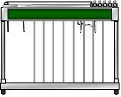
I can't resist playing with images:
<center>

</center>
You can right click on it and "Save Picture As...". It's GIF with a transparent background.
Posted: 5 Mar 2003 10:12 pm
by Michael Marchelya
Bobby, I go by "Mike" but the user name requires "Michael". I guess that's because of the paypal arrangement when I signed up. If you can change that, it would be great. When somebody types "Michael" in the reply it makes me feel like they're mad at me and I only just got here!
Thanks everybody for the great images. Bobby that one is really swell. But mine is blue.

And it's a twelve string.

And it's got one more knee lever.

And it's got a couple less pedals.

Hey, is that a single coil pickup on that thing or a humbucker?


No worries, it's gonna work just fine as is! Thank you very much. I got the strings you sent on Saturday and I think I just ordered them last Thursday. Great service. I appreciate the help and I'm glad to be part of the FORUM.
Posted: 5 Mar 2003 11:06 pm
by CrowBear Schmitt
i for one really like Jerry Gleason's compArt

Posted: 6 Mar 2003 12:25 pm
by Bill Ferguson
Now Bobby,
Why did you have to go and remove the logo's from my steel pix?
Well at least, it is still a "ONE OF A KIND GREEN". Yep no more like it. I found the laminate and sent to for the steel.
The whole beauty of having the logo in Word format is that you can change it around to match your steel without too much hassle.
Bill
PS Just teasing with you Bobby<FONT SIZE=1 COLOR="#8e236b"><p align=CENTER>[This message was edited by Bill Ferguson on 06 March 2003 at 02:23 PM.]</p></FONT>
Posted: 7 Mar 2003 8:08 am
by Bruno Rasmussen
Hi Michael
I made this one last night after I saw your post. If you can use it, your welcome, and everybody else too. The picture has no background for better integration with various backgrounds.
If you want the guitar in another colour, please mail me.
Bruno Rasmussen

Posted: 7 Mar 2003 8:42 am
by Bruno Rasmussen
Sorry 'Mike'
Didn't see your later post before I posted, and generelly I'm a friendly guy.

Posted: 7 Mar 2003 8:18 pm
by Doug Beaumier
Spectacular! I don't know how you did it, but it looks great.
I wonder why the image is slightly larger when posted here on the Forum? When I go to the URL of the image it's a little smaller. And when I save the image to my desktop it's also a little smaller than it appears here.
------------------
<font size=-1>
My Site - Instruction |
Doug's Free Tab |
Steels and Accessories</font>
Posted: 8 Mar 2003 5:03 am
by Damir Besic
very cool stuff
I only don`t understand why delete Emmons logo?<FONT SIZE=1 COLOR="#8e236b"><p align=CENTER>[This message was edited by Damir Besic on 08 March 2003 at 05:03 AM.]</p></FONT>


 And it's a twelve string.
